Textures & backgrounds: the designer's secret weapon for depth and style
Paper, concrete, fabric, gradients and abstract surfaces — how designers use textures to make flat layouts feel tactile.
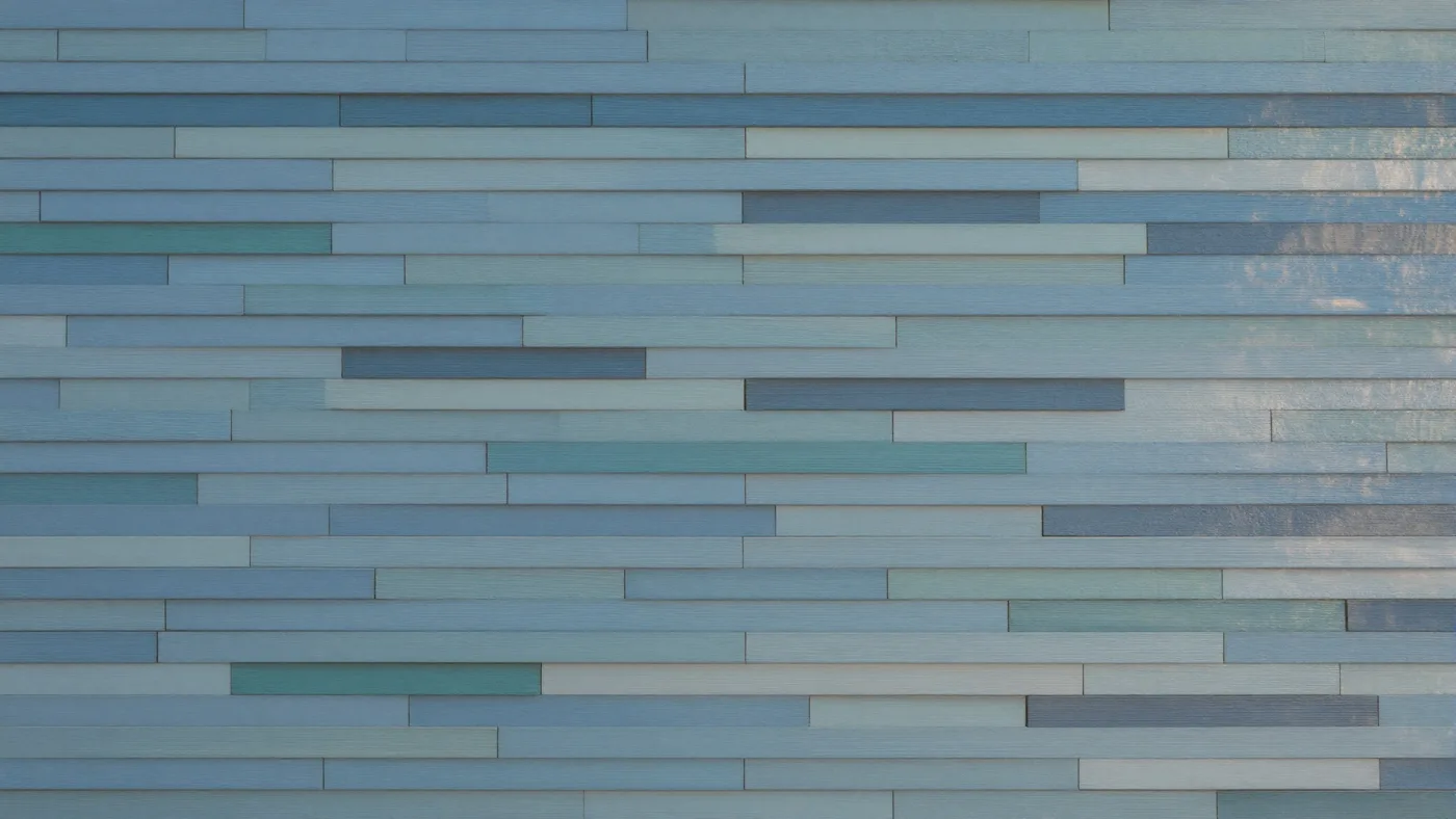
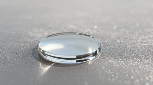
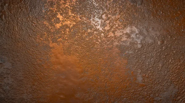
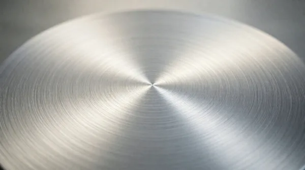
Flat colour is clean, but it can feel empty. A subtle texture behind a layout adds depth and personality without competing with the content.
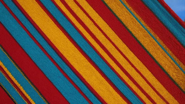
Posters, flyers and print
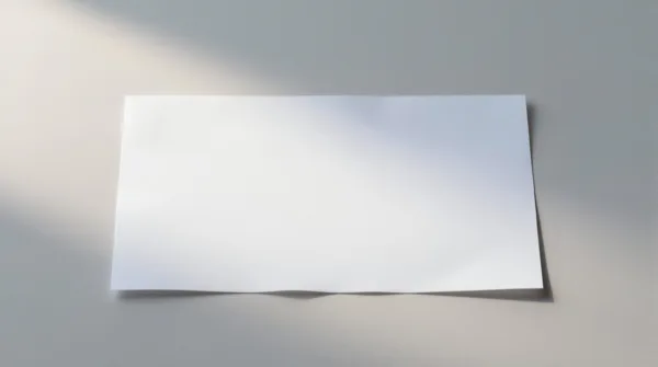
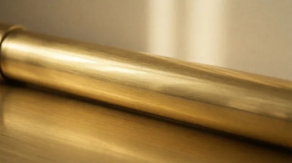
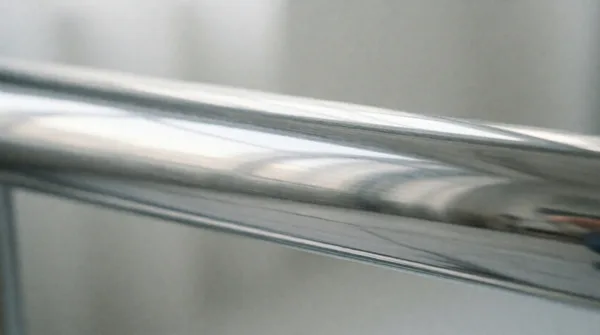
Paper, grain and concrete textures make a digital design feel printed. Set the texture layer to multiply or overlay in your editor and lower its opacity until it is felt more than seen.
Social media templates
A recognisable background texture is an easy brand signature. Use the same one across every quote card, carousel and story so your posts are spotted in a feed.
Websites and apps
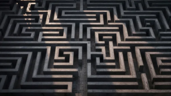
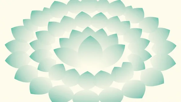
Large, quiet backgrounds — soft gradients, blurred light, smooth stone — work behind login screens, empty states and section breaks.
3D and motion work
Textures are useful as materials and environment maps in 3D scenes, and as overlay layers in video edits for a film or retro look.
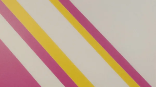

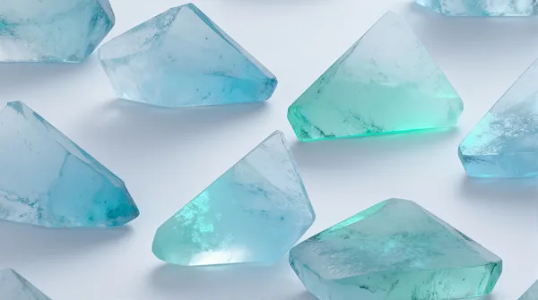
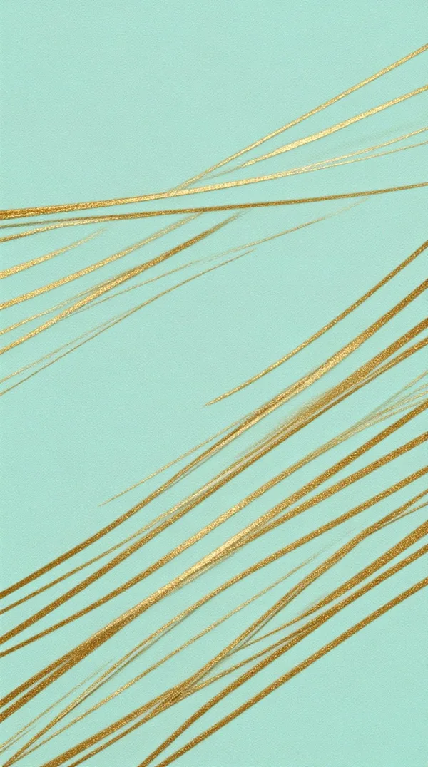
Browse all Backgrounds images →
Tips
- Search by material: paper, marble, fabric, rust, gradient.
- For text-heavy designs, pick low-contrast textures.
- Square pictures tile more easily than wide ones.